
Complementary colors are primary and secondary colors that are situated opposite each other on the color wheel. Understanding the concept of complementary colors and their applications in makeup, skincare, and color correction can help beauty professionals and estheticians provide effective treatments and care for their clients.
Color wheel and complementary colors
The color wheel is a visual representation of colors arranged in a circular pattern. It demonstrates the relationships between primary colors (red, blue, and yellow), secondary colors (green, orange, and purple), and tertiary colors (colors created by mixing primary and secondary colors). Complementary colors are those that are directly opposite one another on the color wheel, such as:
- Red and green
- Blue and orange
- Yellow and purple
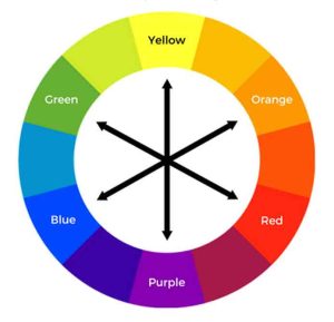
Complementary colors are opposite each other on the color wheel. When placed next to each other, they create a strong contrast that can be visually stimulating. Complementary colors can be used to create a variety of effects, depending on the desired outcome.
For example, complementary colors can be used to:
- Create a focal point. By placing a complementary color next to a neutral color, you can create a focal point that draws the eye. This is a great way to highlight a feature, such as the eyes or lips.
- Add drama. Complementary colors can be used to add drama to an outfit or makeup look. For example, a red dress with a green scarf or a blue eyeshadow with a yellow eyeliner can create a bold and eye-catching look.
- Create a sense of balance. Complementary colors can also be used to create a sense of balance. For example, if you have a lot of warm colors in your outfit, you can add some cool colors to create a more balanced look.
When using complementary colors, it is important to keep the following in mind:
- Use them sparingly. Too much contrast can be overwhelming, so it is best to use complementary colors sparingly. A good rule of thumb is to use one complementary color as the focal point and the other color as an accent.
- Consider the overall effect. When choosing complementary colors, it is important to consider the overall effect you want to create. For example, if you want to create a sense of drama, you might choose bright, saturated colors. If you want to create a more subtle look, you might choose muted, pastel colors.
- Pay attention to your skin tone. Complementary colors can also affect the way your skin tone looks. For example, if you have cool undertones, you might want to avoid using warm complementary colors, such as red and orange. If you have warm undertones, you might want to avoid using cool complementary colors, such as blue and green.
By understanding how complementary colors work, you can help your clients choose colors that flatter their skin tone and create the desired effect.
In addition to the above, here are some other tips for beauty professionals and estheticians when using complementary colors:
- Consider the client’s hair color. The client’s hair color can also affect the way complementary colors look on their skin. For example, if the client has blonde hair, they might want to avoid using warm complementary colors, such as red and orange. If the client has brown hair, they might want to avoid using cool complementary colors, such as blue and green.
- Consider the client’s eye color. The client’s eye color can also affect the way complementary colors look on their skin. For example, if the client has blue eyes, they might want to wear complementary colors that are in the red-orange range. If the client has green eyes, they might want to wear complementary colors that are in the yellow-orange range.
- Consider the client’s wardrobe. The client’s wardrobe can also affect the way complementary colors look on their skin. For example, if the client tends to wear a lot of neutral colors, they might want to avoid using complementary colors that are too bright or saturated. If the client tends to wear a lot of bold colors, they might want to use complementary colors that are more muted.